For years, the AuthaGraph has been an intriguing but elusive map projection that has dazzled the press, impressed laypeople, and confounded cartographers. After winning the “Good Design Award” for its creator, Hajime Narukawa, back in 2016, the AuthaGraph took the media by storm, being praised by some as “Revolutionary“, “Probably The Most Accurate World Map Ever“, and “The most accurate map you’ll ever see“. The Japanese government even announced that it would be phasing the AuthaGraph into use in high school textbooks. If Narukawa wanted his map to become the next Gall-Peters, though, then he made a fatal mistake: he hasn’t released the equations. No one knows how to make AuthaGraph maps, and anyone who wants one has to get it through him.
Until now, that is.
The AuthaGraph thought it could hide its true nature from all of us indefinitely, but it was wrong. It didn’t account for me. By using the few images of their map that are available online along with the vague hand-wavy explanation of how AuthaGraph is constructed, I have successfully reverse-engineered an approximation of AuthaGraph that is virtually indistinguishable to the eye. My recreation may not be perfect, but it is far closer than any replication I’ve seen yet. That’s what you get when you study a map projection in all of your spare moments for a week (Why did I do this? I have no idea!).
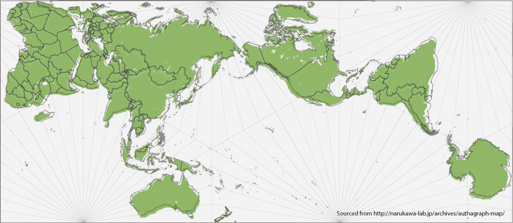
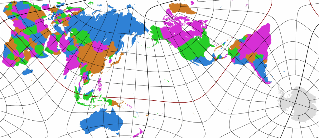
To start reverse engineering this map projection, I took Narukawa’s descriptions of the AuthaGraph’s creation and used them to create mathematical formulae. I constructed the 96 regions they describe and show in the top picture. To simplify things, I took the limit as the number of regions went to infinity and did calculus to it, resulting in an angle-mapping that transfered those regions from triangles on a sphere to hexagons on a plane while keeping their relative areas the same:

Here, λ is the relative longitude of a point on the globe, taking the nearest vertex as the north pole, and θ is the angular coordinate of a point on the plane, taking the nearest vertex as the origin.
Applying that mapping to a tetrahedron results in something like this.
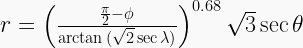
If you noticed in the top picture, the 96 regions are very long. Whilst AuthaGraph purports to maintain their relative sizes, it says nothing about how landmasses are distributed within them. I got the best fit to AuthaGraph by applying a power curve inside them so that the distance of a point on the plane from the nearest vertex was proportional to the distance on the sphere from the nearest vertex to the 0.68th power, with proper normalizations to prevent discontinuities of course:
This pushes points away from the vertices, where distortion is greater, reducing overall shape distortion.

Next, I applied a simple rotation to change the aspect. By examining AuthaGraph maps closely, I established the location of the North Pole to be about 77°N, 143°E, just north of the Lyakhovsky Islands, with a standard parallel of around 17°W.

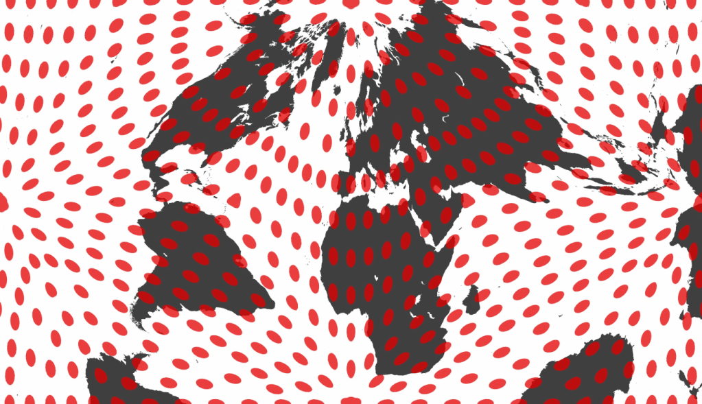
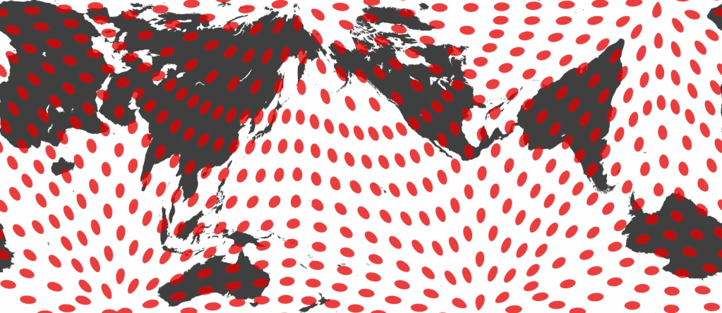
Finally, I rearranged it into the configuration they published, which required measuring the lines on published AuthaGraph maps, resulting in my final map. Note that while the Tissot’s Indicatrices (the red circles) reveal substantial size distortion, the worst of it is confined to the oceans and Siberia.
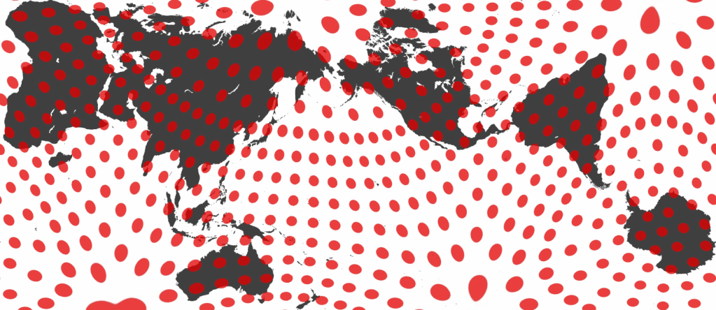
Out of curiosity, I modified AuthaGraph to actually be authalic. Replacing the power function with a more intelligent trig function yields an actually equal-area map:

Naturally, it sucks landmasses into the pointy corners and distorts shape far worse. No wonder they placed their 96 regions in such a way that they could get away with that power function.
While my AuthaGraph is not perfect, neither is the real AuthaGraph. Furthermore, mine bears the distinct advantage of having the equations published openly at github.com/jkunimune/Map-Projections. With a newfound ability to evaluate this map, I can now confirm that AuthaGraph is almost as good as people make it out to be.

In the distortion metrics I have created, where 0 is no distortion and bigger numbers are worse, AuthaGraph ranks at an impressive 0.265 in terms of average angular distortion. That’s compared to Mollweide’s 0.594, Behrmann’s 0.534, and Winkel Tripel’s 0.415. Of course, the former two are actually authalic. AuthaGraph sacrifices this property, generating an average size distortion of 0.399. That pales in comparison to Mercator’s 0.845 but is still greater than Winkel Tripel’s 0.231. The unique advantage of AuthaGraph over Winkel Tripel, though, is that the size distortion is well-confined to the four singularities, which can be placed far enough away from inhabited areas that it actually appears quite close to being equal-area. While this projection has some questionable design decisions (I’m not a fan of the Pacific Ocean in the middle of the map), mathematically speaking, this is not a projection with which to be trifled.
Edit: The authalic distance mapping I created to make my tetrahedron authalic is equivalent to that of the “Vertex-oriented great circle projection” published alongside many others in
(2006) “A ‘Slice-and-Dice’ Approach to Area Equivalence in Polyhedral Map Projections”, Cartography and Geographic Information Science, 33:4, 269-286, DOI: 10.1559/152304006779500687
Also note Marcin Ciura’s similar AuthaGraph reproduction on their WordPress.

Great work! Is there a way to use this in a program such as qgis to reproject given raster (or vector) data? Many thanks
LikeLike
Thank you! I’m not familiar with qgis, but if it works with equirectangular PNGs, then yes. My “Map-Designer-Raster” program at https://github.com/jkunimune15/Map-Projections takes equirectangular raster images as input and reprojects them to various projections including this one. If you want vector data, I also have “Map-Designer-Vector”, which takes SVGs, but it’s much more finicky, so it might not work with some inputs.
I know D3 is also working on a port of these equations for their data visualisation suite at github.com/d3/d3. I haven’t used it, but it looks quite good.
LikeLike
Thanks for that, I’ll have a look into that. qgis is software that can be used to reproject images, but I think the projection equations need to have an inverse (to be able to reproject between any pair of projected images). I have used d3 in the past, but I don’t want to do anything webbased at the moment and it’s quite a dtour to use it to reproject 🙂 Best wishes
LikeLike
Excellent work! I wish I could convert my own vector files to .svg. I have not yet been able to perform this conversion successfully in order to reproject them to Authagraph with your software. I would like to know if you could tell me how you did the conversion to .svg of the data contained in the Map Designer Vector software. Thank you.
LikeLike
I replied to your email, but in case anyone else reads this and is interested:
Basically, the SVGs need to be completely made out of paths; my program ignores lines and polygons and circles etc. because I never taught it how to read those. Also, the way it converts X and Y in the SVG to spherical coordinates on the map is by assuming an equirectangular projection whose size and position is given by the bounding box argument at the top of the file, so that needs to be set correctly. It’s not pretty, but I haven’t figured out a better way to do it yet.
LikeLike
This is incredible dude.
LikeLike
Thanks for taking the time to do this!
LikeLike